Saturday, May 2, 2009

Final Project: Final Post

These are my final paintings. Overall I am happy with the outcome because they are visually interesting. They also have a believable quality to them (despite their cartoon quality). I worked about as much as I could without going brain dead. I might go in and work them a little further later. 

It seems as if art sometimes has a mind of its own. Even though I intended on making these more painterly, they seemed determined to be animations. I tried to work painterly elements back into them after they were complete. The last painting I did (which is the last one on this page) seems to be in a league of its own. I think this might be because the woodwork was particularly interesting for me to draw. The composition is also more dynamic. 


Sunday, April 26, 2009

Pretty in Pink


Pink is bold, bright, and eye catching. The color in this monochromatic theme is stark and therefore attractive to the eye. The designer is giving the viewers instructions. It's as if he/she is saying, "Look at this, this, and this. The rest is icing." At first glance, a viewer can glean all the important information including leading actress, film type, and film title.

Another design element in this cover is framing. Because the words are framed, they feel anchored and concrete. The solid strips of color create a contrast to the words. The contrast in addition to the bold type face creates easy to read words. 

The frames divide the composition into thirds and the larger black frame creates a balance to the smaller pink frame. The photograph also considers thirds. The shorter actor, Molly Ringwald, creates two diagonals that bring the eye through the composition. She also creates a triangle with the other actors, which brings the eye back up to the top of the cover. 

This cover is successful because in one glance, the viewer can glean all important information. However if a viewer wants, he/she can find many things to look at longer. 

Final Project: Photoshop Steps

This week I finished two paintings. Below is a layer by layer progression of steps.

After I finished a layer of under painting, I paid more attention to the final colors I wanted visible. This layer is a series of loose washes laid with consideration to the boundaries of major shapes. Much of my original sketch is covered or heavily obsqured.


After picking colors, I laid down a layer of high lights and shadows. Also on this layer, some of the details have been worked back in for clarification. I like to work back and forth between increasing the clarity of color and line.

This layer further works the clarity of color and line. Details are finely rendered by this point.

Before pronouncing a work finished, I always go back and rework lines. The power lines are the most noticable rework. There is work on other lines as well. This layer sharpens the image and increases contrast.

The last layer is a 25% opaque picture of watercolor paper. This softens the painting and adds some texture. Also, when I add this layer ontop of all five paintings, it will work as a unifying agent.

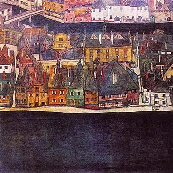
This is the second house I have finished. I am still behind on schedule by half a painting. (I have done another half painting that isn't posted).

My layers are as follows: sketch, color blocks, color washes, highlights and shadows, clarification of color and line, final sketch, and opaque texture. My layers have been steps rather than elements of the painting. Sometimes I prefer doing this because it mimics the way oil paintings are layered.

So far I feel like my paintings are a personal success. Including landscape backgrounds into paintings and painting architecture are two firsts for me. Painting the more geometric forms of architecture is not as enjoyable to me as the organic shapes of figures. I have however convinced myself that there is merit in this kind of work. My only major quam at the moment is that the houses are appearing slightly cartoonish. I sometimes have trouble getting away from that when I create digital art.

Next week, I should have the remaning 3 houses complete and posted!

Saturday, April 18, 2009

Final Project: Inspiration and Initial Sketches.

I'm painting 5 house paintings, and I'm going to show a step by step process for one of them. 

Life has been hectic this week, so my project progress has been slow. So far I revisited my inspiration, Egon Schiele. I also drew out initial sketches and filled in a base color. 

These houses were painted by Egon Schiele: 

This is a rough sketch. Its purpose is for me to get the gist of where lines will be. Final lines will be sketched in a few layers. 


Next, I filled in a base color. This is also sloppy and just an undercoat. The colors are not the final colors, but may show through the top layers in places. 


Silent Hill


If there is one thing both Silent Hill the game and Silent Hill the move are good at, it's mist. This movie poster does an exemplary  job. The mist is textured, layered, pure, and appropriately mysterious.  It creates the base which this poster design is built on. 

The guide rail, words, figure, and town sign pop right out of the mist because of the contrast and because our eyes want to find whatever is hidden in this thick fog. This poster is playing on our survival instincts. 

The guide rail keeps us contained in a loop of information. We follow it along the words, past the person, to the sign, and back around to the words again. Our eyes can not leave this circle because we are contained. In this way, we are put in the shoes of the figure. 

Another effective design element is the color scheme. Everything is muted and blends into the fog except for the words silent hill. "Silent Hill" is starkly contrasted and yet still appears distorted because of he font. This distortion keeps "Silent Hill" consistent with the rest of the poster. 

Overall this poster is very effective. It creates a feeling of wandering, searching, and survival. Those are the central elements of the movie it is advertising. 

Sunday, April 12, 2009

Opeth


While this is not my favorite Opeth album cover, it might be the most well designed. Perhaps Opeth not only had a change in lineup, but also in designers. 

The framing device created by high contrast lighting is very intriguing. A geometrical layout is created. A rectangle and connecting triangle direct the eye. Although the subject of the cover is in black, it is still central because the light creates a secondary frame. 

The monochromatic color scheme was an intelligent choice. The high contrast lighting is emphasized and complimented by the limited color palette. The color palette also compliments the joint theme of mystery and luminosity. Although the subject is illuminated, it's back is turned and details are sparse. 

Text is center aligned and contrasted to it's background. This placement emphasizes the subject and the rectangle. Delicate font makes the text difficult to read, but I think this makes us look closer rather than acting as a deterrent. 

Overall I think this is an excellent design for a metal album. Its simplicity is elegant and speaks for Opeth's style; 1800s reminiscent. 

Final Project: Photos

With the decline of the US economy, urban decay has become an increasingly relevant subject. I'm interested in the rising number of abandoned buildings in Richmond as an art subject for my final project. 

I took some photographs this weekend. These are a few of my favorites. The last five have been chosen as references. 


Tuesday, April 7, 2009

Playing with HTML II

IMAGE

IMAGE with Boarder

This text is aligned top

This text is aligned middle

This image is aligned left


This image is aligned right

Click here to go to blogger in a new window.

Click here to go to blogger on this page.

Friday, April 3, 2009

Squirrel Nut Zippers


The overall concept for this album cover is effective. Squirrel Nut Zippers is a swing band. So, the club sign and lights are consistent with the genre and create an upbeat and appropriate mood.

The color scheme is subdued oranges, reds and blues. Contrast is accomplished through subtle changes in the strength of colors and a balancing burst of bright green and white. The variance in color stregth enhances the illusion of layering and depth.

Text is center aligned and hierarchal. This design is smart because it reuses design elements most people are accustomed to seeing in theater and club signs. Although there are competing elements, the viewer already knows how to read this album cover.

The line quality produces enough action that the viewer gets excited and doesn't lose interest. Visual interest is held through all aspects of design.

Thursday, April 2, 2009

Playing with HTML

bold

italic

underlined

color

font font

strike through

justify right


justify left


justify center


BIG


Text superscript

Text subscript


http://www.echoecho.com/html.htm

Monday, March 30, 2009

Baby with Razor


A baby with a razor!!! The image is shocking and eye catching. This baby is extra angelic looking because of the limited and subtle color palette and white dress. 

"Gillette Safety Razor" is the next picture element that catches the eye. The text is yellow and large. Because all other elements are significantly lower key, it's easy for the subconscious to make the connection that Gillette safety razors are so safe a baby can shave itself. 

Repeating color and complementary color is used to promote a feeling of unity and contrast within the design. Although there are different alignments, they are successful because of their proximity. In this ad, words are used as a framing device. 

Overall, this image is easy to ready because the eye receives organized cues. The design is not so simple that the eye gets bored. I find the work to be successful primarily because of its shock value. Marketers are always creating gimmicks. The fragility of babies does not seem to get old  and is a universally understood message. 

Thursday, March 19, 2009

Cut and Paste: Revised

       
New                                    Old

For this revision, I changed the font of "Cut and Paste" and deleted the logo on the upper left corner. This eliminated two unnecessary elements. I also experimented with changing the size of the dogs. I'm not sure if that was beneficial, so I left them the same size. 

Red Cross


I get a kick out of vintage posters because of their lack of subtlety. Marketing used to be so honest.

Join the American Red Cross because it's a patriotic thing to do. Three colors comprise this poster. The woman is wearing the shades of red, white, and blue found on the American flag. Also, the shade of red on the cross is emphasized. After viewing this poster, the viewer is supposed to see an implied blue whenever they see a the red cross symbol.

Another use of blue is in the background. This muted blue contains a scene of particular tragedy. Women and children are in a flooded neighborhood. When I see this, I feel guilty that there are Americans living in such awful conditions.

Overall, there is good contrast between the bright and then muted colors. Size is contrasted as well between the subjects in the foreground and background. Colors are repeated. There is a neat and consistent center alignment. Proximity is considered. The woman and text are popped forward from the background.

Overall this poster is very effective. I would like to go back in time and see if this poster was as equally effective in its time.

Sunday, March 8, 2009

Cut and Paste


I'm pretty pleased with this ad. Contrast is obvious with color and also with font. Repetition is accomplished with the scotty dog and color. Consistency is kept with font. Alignment of words is left and set on guides. Words are separated into thirds and placed on the top, center, and bottom of the page. This creates a proximity relationship. C(ontrast)-R(epitition)-A(llignment)-P(roximity) was considered. Robin Williams' book was very helpful in doing this exercise. 

New Logo for Ad


Here is a reworked logo for use on my art exhibit ad. It's a combination of other (simplified versions) logos. 

Friday, March 6, 2009

Organ Repossession has been Legalized!


I love this poster because of its playfulness. 

This is an advertisement for Repo Man: The Genetic Opera. Industrialization, futurism, and the gothic lifestyle are visual themes in the movie and in the poster. The image, color theme, and bold lettering make these visual themes. Overall the mood of this poster is somewhat cold and automated. 

The element of reflection is powerful. Although the reflection is not exact (this creates visual interest), repetition is evident. Color and font are mainly on a checkerboard theme. Shapes are on a strict reflection basis. 

Font differences are minimal but evident. There is a slight conflict created and the viewer feels uneasy and a bit visually overwhelmed. In this case, I feel the viewer should feel overwhelmed. The eye is easily guided through this poster. The eye starts at the largest words, "Repo Man," and then goes up to the top of the page to read what is being said about repo man. The down pointing arrows help to direct the eye as well. The arrows and the similar reversed shape bellow them frame repo man and divide the poster into uneven thirds.

It's the details in this poster that make it work. Some letters are backwards to restate the idea of reflection. Repoman changes color when he is reflected. 

While some might find this poster overdone or overwhelming, I am excited by it. 

Tuesday, March 3, 2009

Can o Cat


 I tried to eliminate everything unnecessary. If you know you want a can of cat, than you will buy this. Otherwise, there is not much here to try to persuade you. 

Wednesday, February 25, 2009

McLean Logo: Step 5

Step 5: Favorite and Summary. 

My process began with research, brainstorming, and sketching. Keeping a theme of scottish history became important. Then, I created a color pallet and library of basic shapes. Lastly, I combined elements and corrected myself as I went.  I used silhouettes in part because it's difficult to draw on Illustrator. All in all, I'm proud of my designs, especially because Illustrator is not historically my strong suit. My favorite design is bellow. I chose it because it fits the more streamlined light designs coming out currently, but it also keeps some of our scottish clan designs. 


McLean Logo: Step 4

Step 4: Final Designs